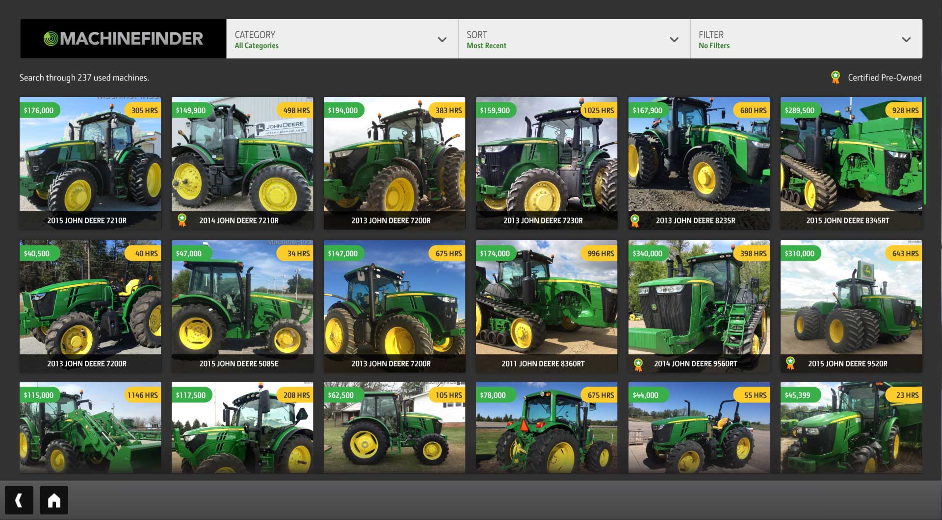
The Challenge
Help dealers sell their used equipment inventory and raise awareness to customers about equipment at other dealerships.
The Approach
Business Goals
VS Networks goals were to provide an additional application on the John Deere touchscreen that would help increase the value of the system. John Deere dealers were interested in a solution to help sell used equipment more efficiently.
Research
We interviewed store owners and talked to experts at John Deere and received invaluable insights about used equipment. We were able to spot the pain-points about selling the used equipment.
Pain Point #1
Dealers had a hard time marketing the pieces of equipment. They would usually point them to the website or call another dealership, but that became a lot of back and forth. The touchscreen offered an up-to-date list of the inventory from inside the store. The customer could easily search and send specifications about a piece of equipment they were interested in. Even if it was 250 miles away.
Pain Point #2
Dealers had no way of capturing email leads for the internal sales people. This application offered a really simple way to do that. You would have to enter an email to get information about a certain piece of equipment.
User Stories
- - As a riding lawn mower owner, I want to find a new plow, so that I can replace my old one that broke.
- - As a ranch owner, I want a slightly used second utility tractor, so that I can get my daily tasks done faster.
- - As a farm fleet owner, I want an additional combine, so that I can expand my fleet.
User Personas
Persona 1
- Product: Machinefinder
- Name: Arthur Miller
- Age: 63
- Title: John Deere dealership owner
- Motivations: Bring in more money.
- Goals: Sell more used equipment.
Persona 2
- Product: Machinefinder
- Name: Jim Zapata
- Age: 50
- Title: Owner of Zapata Ranch
- Motivations: Wants to complete ranch tasks more efficiently.
- Goals: Buy additional tractor to get tasks done faster.
User Journey
- Opens app
- Browse list
- Changes categories
- Filters list
- Sorts price hi-lo
- Selects tractor
- Emails information
- Redirect to success screen
- Closes app and redirects to kiosk homepage
Usability Testing
Due to time and budget, we prepared a list of questions to be sent over to power users for unmoderated testing. They would send back answers and give additional feedback. We would also interview them about their feedback with a simple phone call. Testing validated our success criteria of how easy it was to use and find a certain item. It also confirmed the value of the email addresses the dealers would be receiving.
Information Architecture
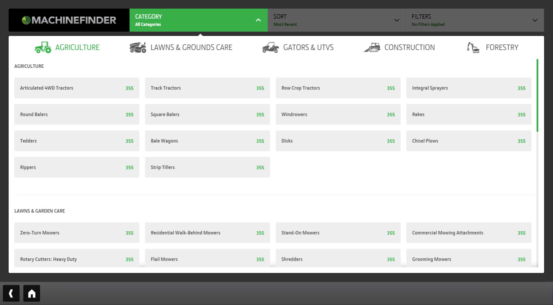
Our goal with the architecture was to keep equipment grouped by their normal tractor categories. John Deere already has these grouped with a well-known naming convention and we followed what they did. The users were already use to the categories.
Wireframes
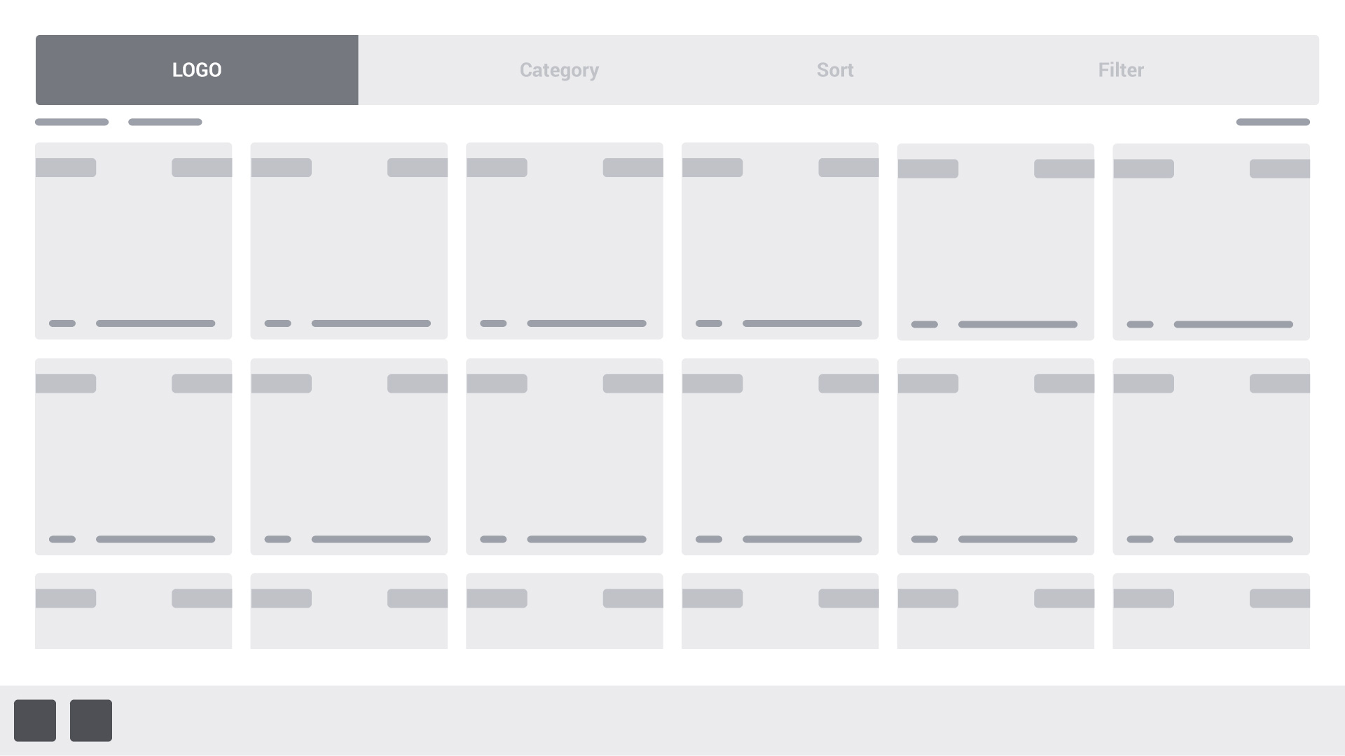
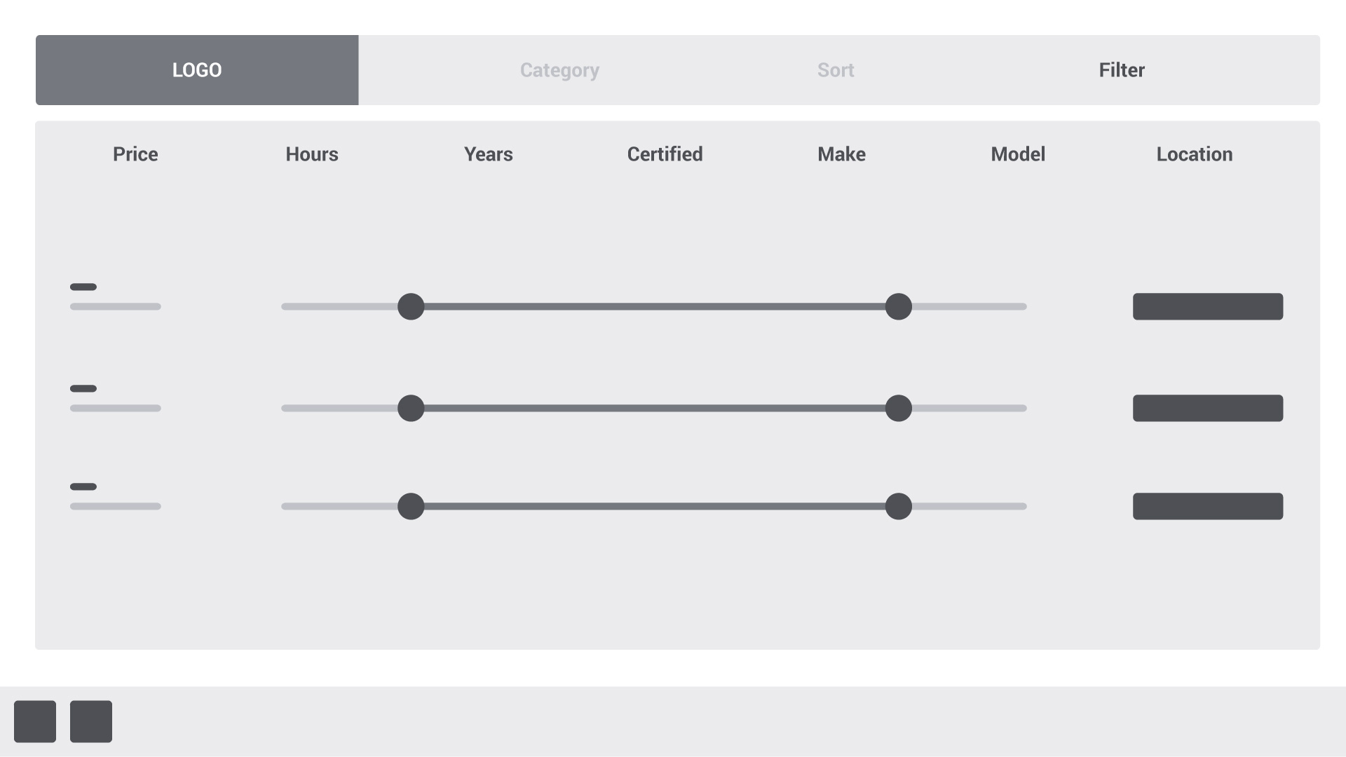

The Designs
Craigslist was a big inspiration
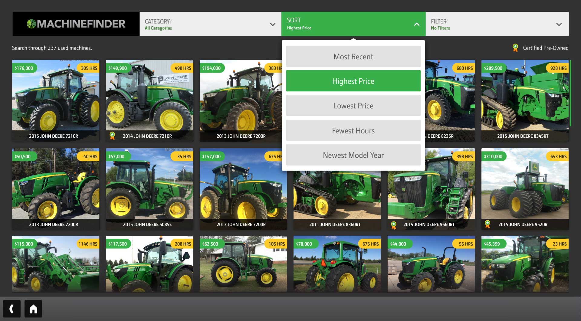
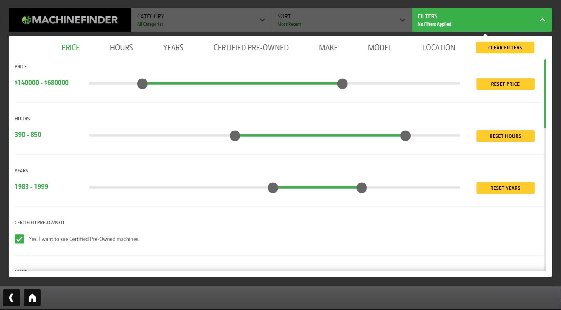
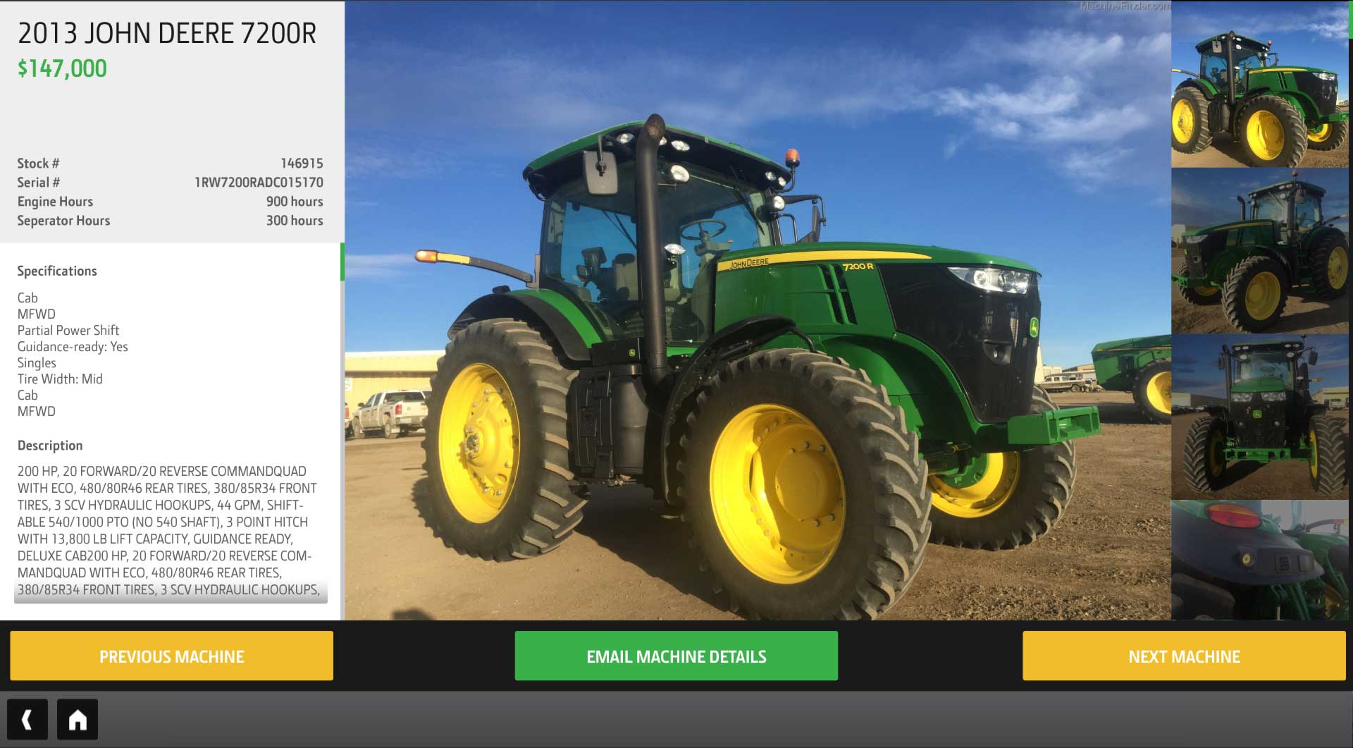
The finished design allowed the customer to quickly and easily search for a used piece of equipment. When they found the item they could email themselves the specifications. This allowed the customer to go home and continue to compare a couple items without the pressure of being at the store. The equipment was displayed in a scrollable list, while being able to filter it with the controls at the top.

The Deliverables
Engineering assets
I provided coded front-end page templates, components, and a design spec to the engineering team. This included HTML and SCSS files with a custom Gulp file for minifying and converting the SCSS to CSS.
The Outcome
Provided an easy to use solution
We were able to launch the new app to over 1,500 dealerships and provided an additional tool to help sell more used equipment and capture email leads. Plus, our app helped sell a $250,000 combine!