The Challenge
Audit + Design Additions
The project consisted of facilitating usability tests, user interviews, auditing current application state, uncover hidden opportunities, and create high fidelity designs. This was also an opportunity to help build onto the first engagement we had with the client and continue our partnership. The time limit was around three weeks and it got a little hectic with business travel in the middle.
My Role
Acted as the Engagement Lead, Researcher, and Design Lead for MOCingbird. My responsibilities included running and presenting progress at daily stakeholder meetings via Google Hangouts, write usability test scripts, schedule user tests, facilitate user tests, data log the patterns/insights from the tests, provide recommended design updates through sketching wireframes, and executing the wireframes in high fidelity designs.
The Background
Keep this in Mind
When I refer to the word ‘Specialty,’ it means a doctor has a specialty in internal medicine or another specialty. Doctors can have multiple specialties that have different amounts of MOC(Maintenance of Certification) points they need to track and acquire to keep their licenses. If they don't keep track of the points and miss deadlines, they will lose their license to practice medicine. MOCingbird helps prevent that from happening.
Also, MOCingbird is attempting to be the one service that every doctor will go to in the future to prove that they can continue to practice medicine with certificates. Their goal is to be a hub for MOC points and continuing education.
The Discovery
Understanding the Doctors Perspective
The previous engagement let us build upon previous research that helped me get up to speed quickly.
Doctor Interviews
MOCingbird supplied us with a list of doctors that they wanted to test the application on. The process just involved a simple email to schedule times.
Test Script
I updated a previous script with updated scenarios.
Testing
Four doctors were ran through scenarios for the onboarding and pages inside the application.
Data Logging
We as a team decided to use Temi to transcribe the audio and then put the audit insights and recommendations into Airtable. This allowed us to easily share findings with the client.
The Opportunities
Uncovered Usability Issues
Here are a few patterns we discovered through user testing.
Specialty Grouping (Problem)
The user tests showed that the doctors were having trouble linking together information on the dashboard. Basically when you click on one element, two other elements would change. The problem was linking back specific specialty information to its own specialty. There were multiple specialties on the dashboard, because doctors can have three or four specialties.
Specialty Grouping (Recommendation)
Generate a new layout on the dashboard that improved the grouping of information related to its own specialty. This gave us the option to add CTAs to metrics that were linked to the specialties. The tasks related to the specialty were then moved to a single specialty page so that it wouldn't conflict with unrelated information.
Onboarding Error (Problem)
Doctors were getting hung up on improper errors. Some of the errors were not descriptive and didn't show the doctors what they were doing wrong and didn't provide a way forward.
Onboarding Error (Solution)
Doctors were getting hung up on improper errors. Some of the errors were not descriptive and didn't show the doctors what they were doing wrong and didn't provide a way forward.
Input Field Confusion (Problem)
Doctors were getting getting confused by some of the language used in the form labels.
Input Field Confusion (Solution)
A recommendation was to update the copy and add a simple note giving more context for what information was actually needed.
The Design
Applying Insights into the Application
**Designs are not allowed to be shown at this moment.**
After discovering patterns through user testing, I was able to start working on wireframes and sketching to target the issues that came up.
Wireframes
I was able to wireframe out ideas to present to the client. After they approved the direction, I would then put them into high fidelity. I had to move fast, because of the very short timeframe.
Updates
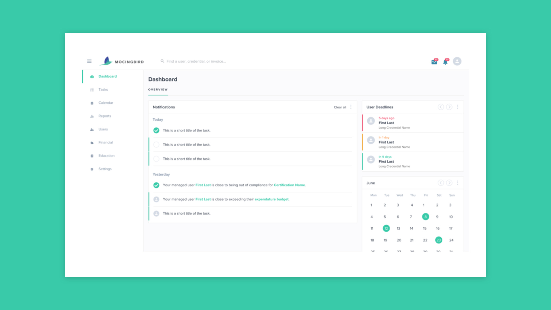
The dashboard and specialty pages got an overhaul that accommodated the new UX recommendations. The biggest challenge was reworking the content architecture.
Components
Designed and added a card to hold specialty information to help with the previous grouping issue. I designed it to be placed anywhere in the application moving forward.
The Deliverables
Design Recommendations
At the end of the engagement, I presented a debrief presentation to the four stakeholders. The presentation included the engagements goals, usability test findings, recommendations, wireframes, and final designs.
Where do I think we failed? I believe that some time should've been used for a second round of testing after we supplied more designs. Due to the timeframe, that was impossible.
The client was happy with the updates and decided to continue for another round of design when they are able to secure more funding. A huge win for Philosophie : )